
Rebuilding site navigation for an enterprise tech firm
Task —
Refactor and rebuild global site navigation for Okta, after the company's aquisition of Auth0, a similar single sign-on company. Needs included adding in Auth0's product line and features, as well as combining disparate messaging of both companies through information architecture.
Project details
Business need
Build a new navigation system to combine separate product lines into existing system
Team members
UX Strategist (me)
Senior Digital Strategist
Director of User Experience
Director of Digital Strategy
General timeline
~3 months, with deadline of Oktane, our annual conference
Overview —
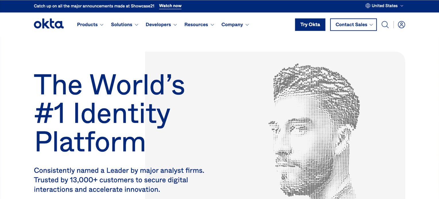
In any modern business, workforce security is key to keeping your business safe, especially in information technology (IT). Malicious parties in today’s world consistently seek to take advantage of companies through phishing, data breaches, and more. Okta’s products solve this challenge with ease and a great user experience with products, such as single sign-on, identity governance, and more.
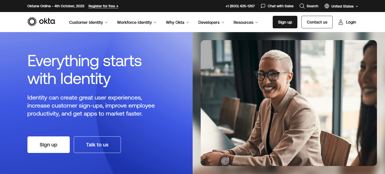
In 2022, Okta acquired Auth0, a customer-oriented security company, one that has similar features including single sign-on, multi-factor authentication, and a universal login feature. With this, Okta needed to update their global website, merging the separate product sets together within one brand.
I was assigned the task of updating the top-level navigation, utilizing previous customer and persona research. To accomplish this goal, I was personally presented with the challenge of integrating all current links from both companies together within the top-level navigation, while keeping the user experience clean and accessible.
Kickoff — Brainstorming & drafting intitial versions
Starting out, the business needs of the project were already vague. During this time, it was still up in the air if the acquisition would even go off, so we had little to work with, other than “think about how this could work, if it did”. With this, we really could only start off with the previous persona research our team had conducted earlier in the year, which focused primarily on the types of content both C-Suite IT professionals and IT decision makers (ITDMs) would gravitate to.
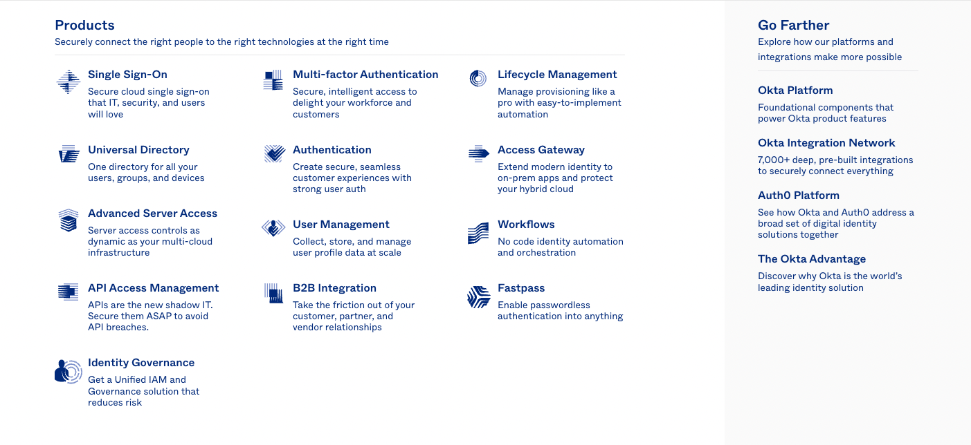
With this, and the knowledge that we would need to hone in on key product pages, I began drafting initial IA spreadsheets / sketches purely within a spreadsheet. With projects like these, I prefer to stay out of the design tool on the earlier steps, and keep options easy to change quickly.
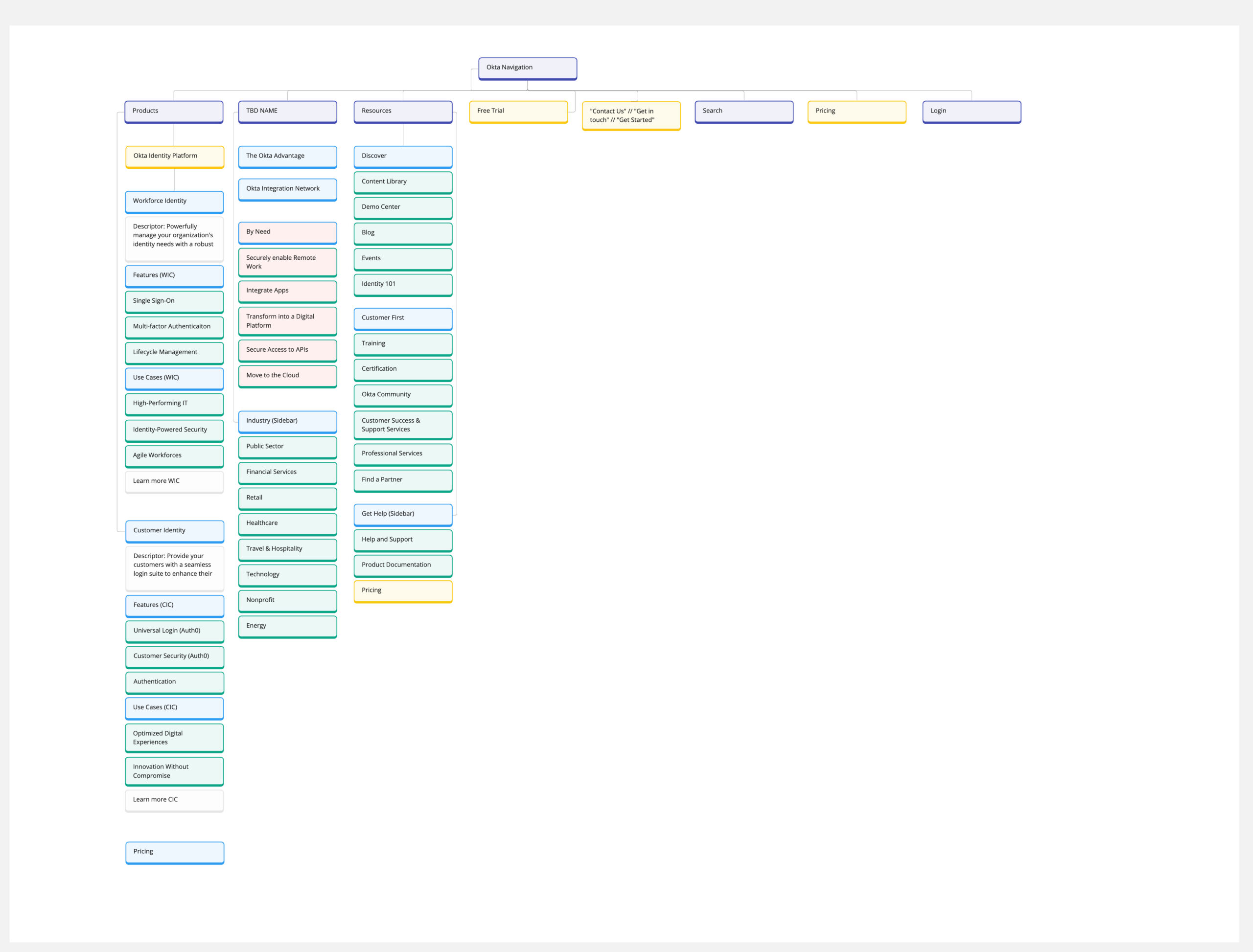
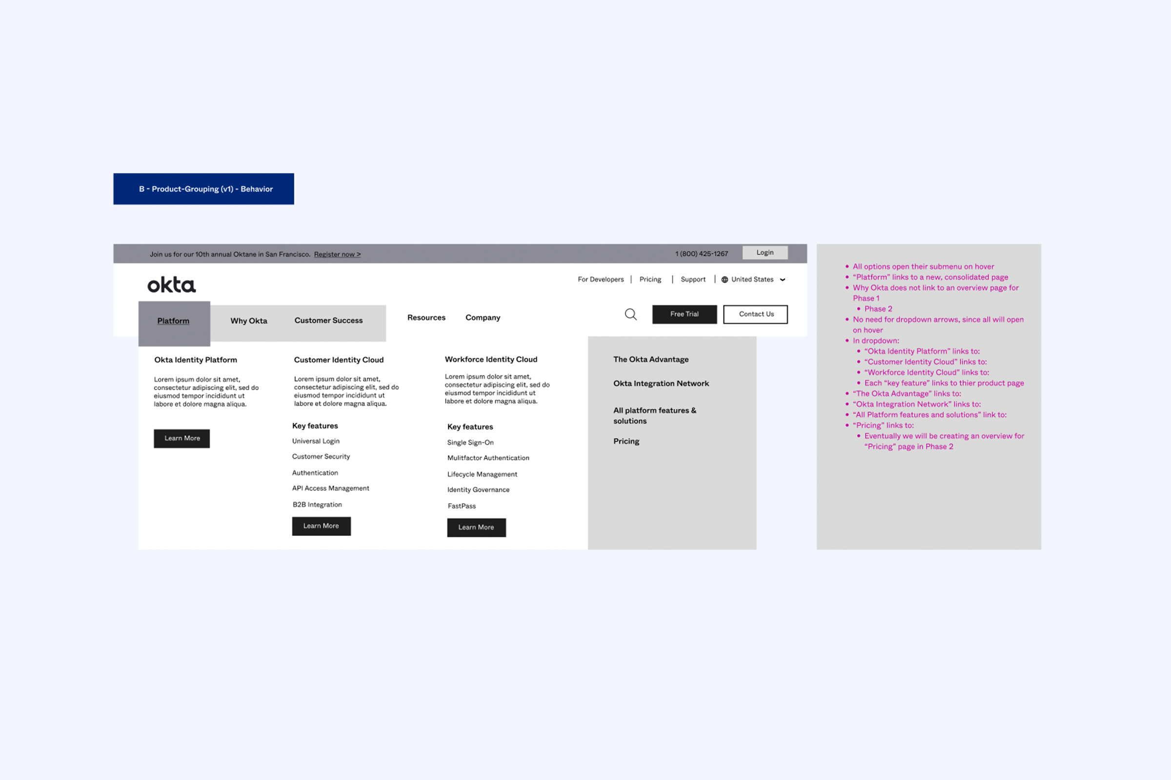
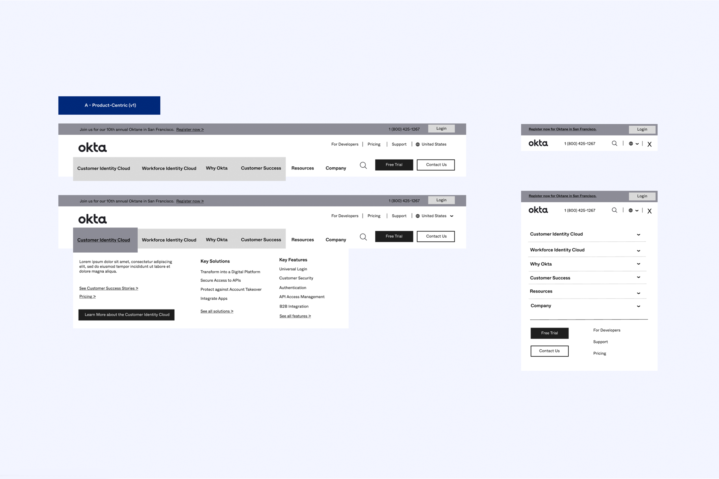
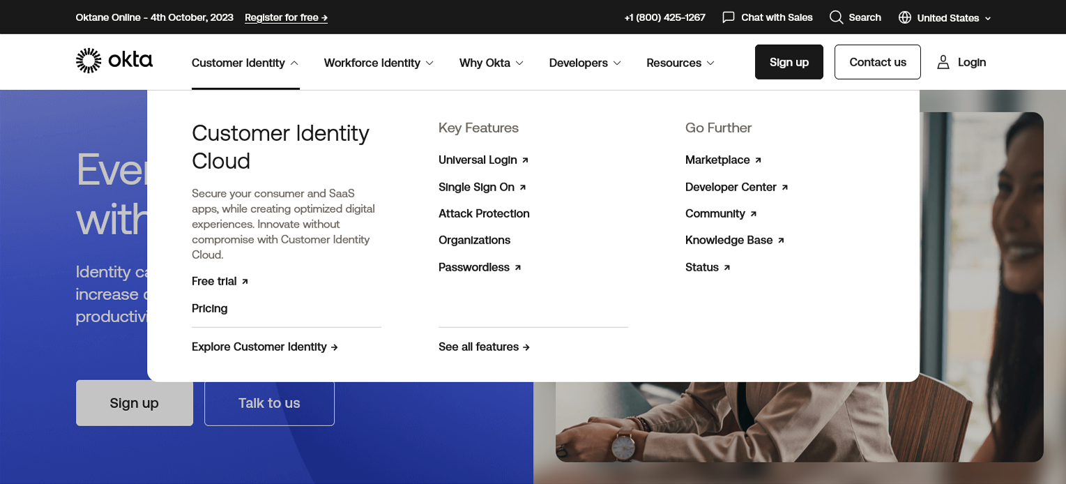
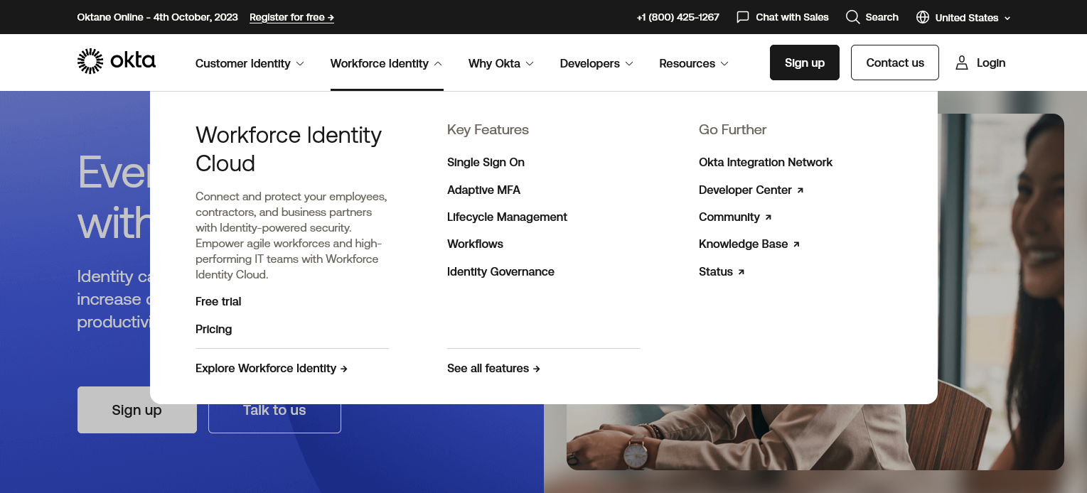
Initial designs settled upon two versions: one that was focused on combining both product sets under one “Products” dropdown, and another focused on keeping the two product groupings separate. Once the options got further along, we ported those spreadsheets into a visualizer like Miro, to present to the team.
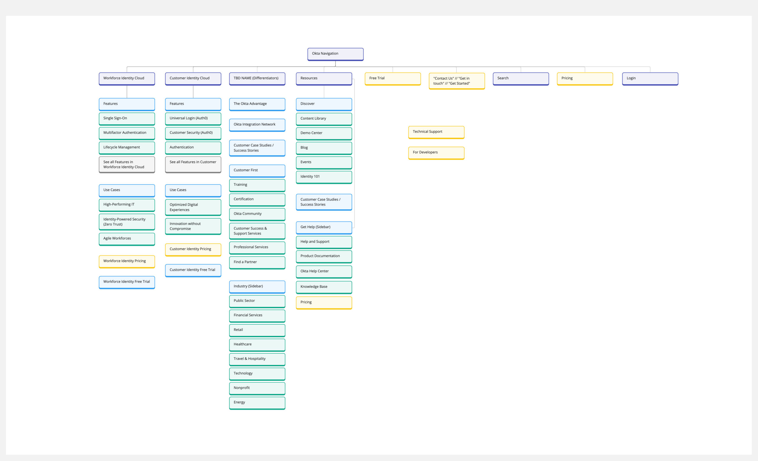

Structure — Refining the options & mocking it up
During the presentation, the initial reception was good, with a few caveats & changes. For one, we needed to find a section for our solutions marketing that would be “middle of the road” enough to encapsulate both company’s messaging, to show the breadth of our offering.
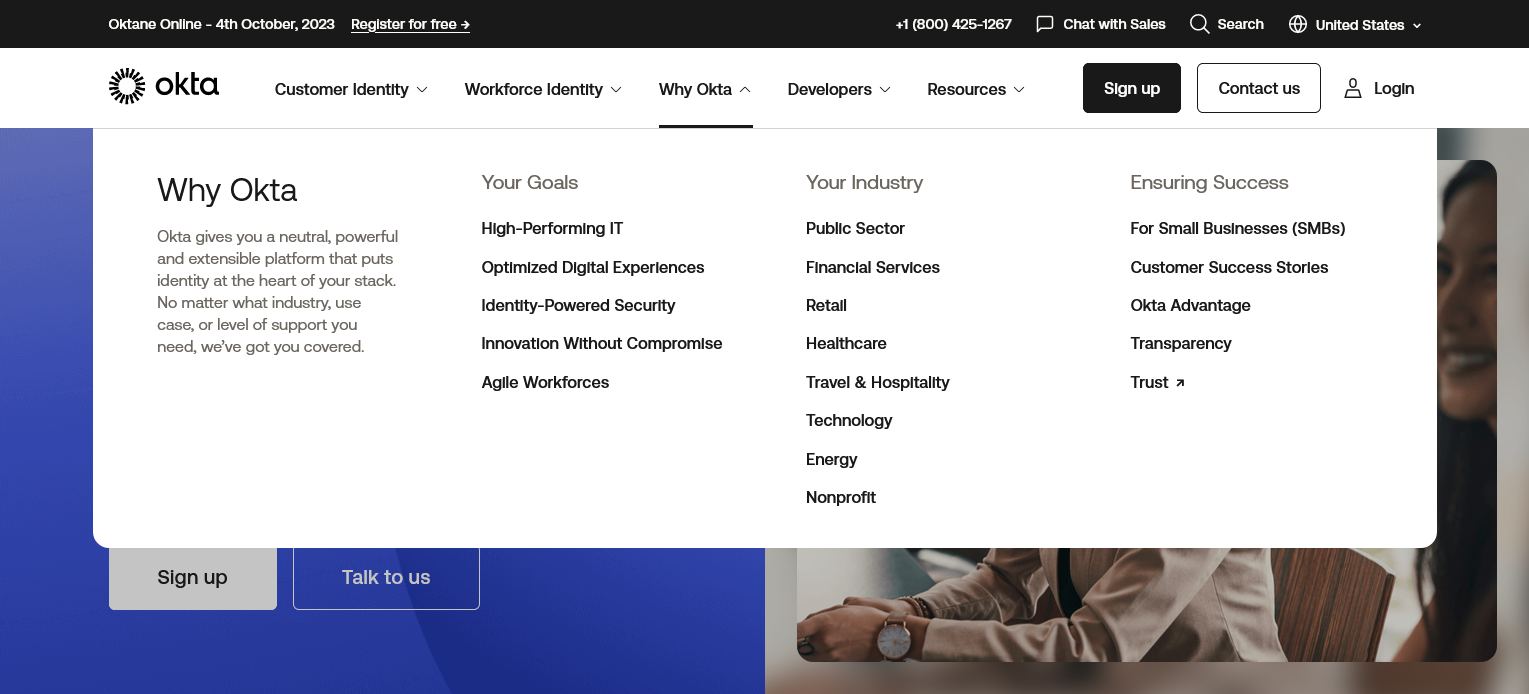
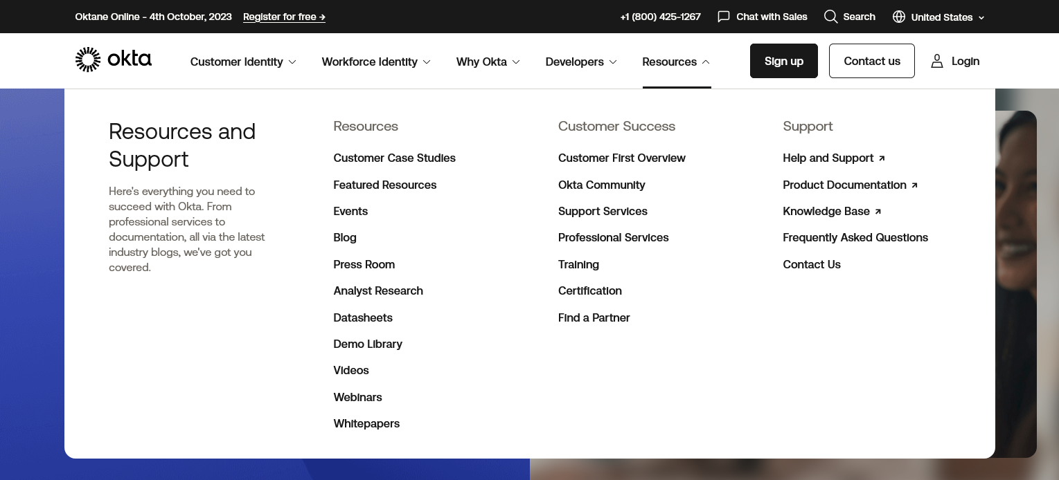
Pretty vague feedback, but the general idea for a solution messaging based section stuck. The need for a more casual, solutioning based section of the navigation was clear, especially as we further related the options to the key personas defined. These individuals have key roles to play in the buying process, with most tasked with defined problems to solve. Asks like “Identity-Based Security” and “Agile Workforces” popped out, and we created a new solutions section titled “Why Okta” to house these demands.
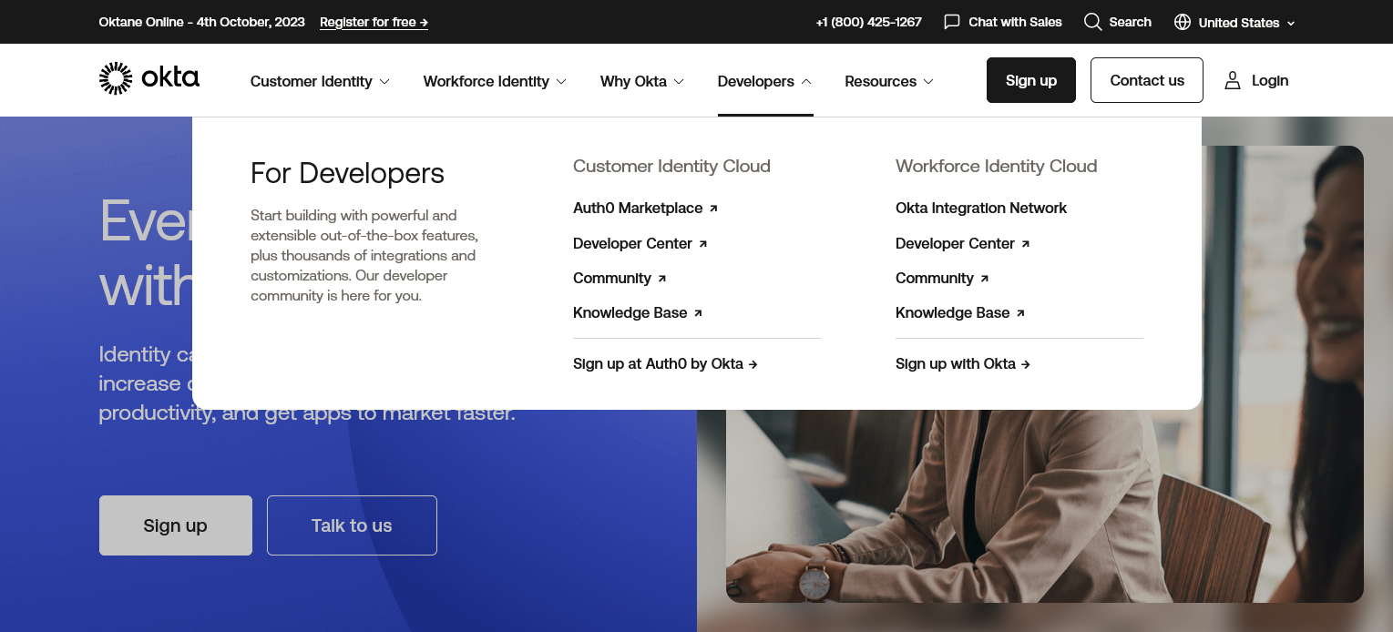
In addition, there was a clear need to create a dedicated section for our platform’s developer audience. Historically, Okta lacked great developer support, and with this new dropdown to support the developer hub, forums, and documentation, we could lay out the groundwork for a full developer section of the site to be created.


Launch — Wrapping up and testing
With this updated version in wireframe, it was time for final review. The Director of Digital Strategy loved the new update, and it was approved with final comments (which were minor changes of titles and labels, at most). With the bulk of our work done, we passed the options on with developer annotations to the Studio (design) and developer teams, to put it in their queue to make the changes live.
With the update live, we ran a suite of qualitative and quantitative tests over the course of the next 6 months. The most fruitful of these tests was a usability test conducted within Optimal Workshop, with the IA abstracted from the visual design.
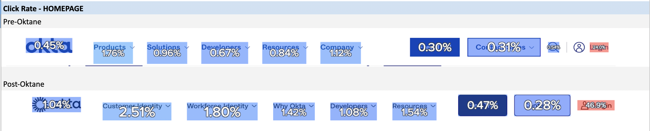
Initial results found that while the new IA did in fact find an uptick in traffic to the new product pages. However, the amount of qualified leads (TQL) driven from those pages initially went down. Thankful, those losses were recuperated through the following quarters, with the new navigation setting up the team for further site updates.
Treejack test results


Live navigation dropdowns
Impact to the business
With the updated IA (information architecture), the fresh new look, our users and prospects immediately responded positively, with many areas presenting both great positive impressions, and with others presenting new challenges:
- Okta’s solutions pages, driven from the “Why Okta” dropdown, had great improvement of interaction, up from 13% to 43% clickthrough rate
- Pricing page searchability / findability was impacted by -7% for the Customer oriented products, as previously pricing links were top level on navigation. This challenge would be later addressed by adding additional pathways to pricing via the product’s landing pages.
+30%
increase in clickthrough rate on "Why Okta" solutions and industry pages, sitewide
+109%
click rate on "tippy top" navigation, new banner area
+126%
click rate on footer, post IA / sitemap updates
+11%
click rate on global navigation across all pages sitewide (including Homepage)
+9%
increase in TQLs via free trial from new nav design