
Okta CityTours DC Livestream Microsite
Task —
Each year, Okta hosts a tour among cities to showcase their products, alongside their vendors and partners. Unique to this year, Okta had their very first online livestream ticket, where attendees could watch live keynotes and partner presentations.
I was tasked with creating the very first user flows and wireframes to be discussed and built, working alongside the development and events teams to scope basic functionality of the microsite. The major goal of the experience was straightforward: get attendees to register for the event, either in-person or online, and allow online attendees to watch the events live.
My team and I delivered a robust user flow alongside a set of high quality visual wireframes. The final files were then handed off to the Developer and Brand teams for their input, graphics, and development, with UX providing guidance throughout the next stages of the project, up into final site launch.
In addition, UX was brought back into the project for a “post-event” experience that allowed previous attendees to re-register or login, and watch past sessions on-demand from the event.
Project details
Business need
Build a complete event microsite template for upcoming event tour
Team members
UX Strategist (me)
Senior Web Developer
Director of User Experience
Director of Digital Strategy
General timeline
~1.5 months, staggered timelines for homepage, registration, and livestream site sections.
Phase 1 - Registration & Homepage - Basic wires and flow
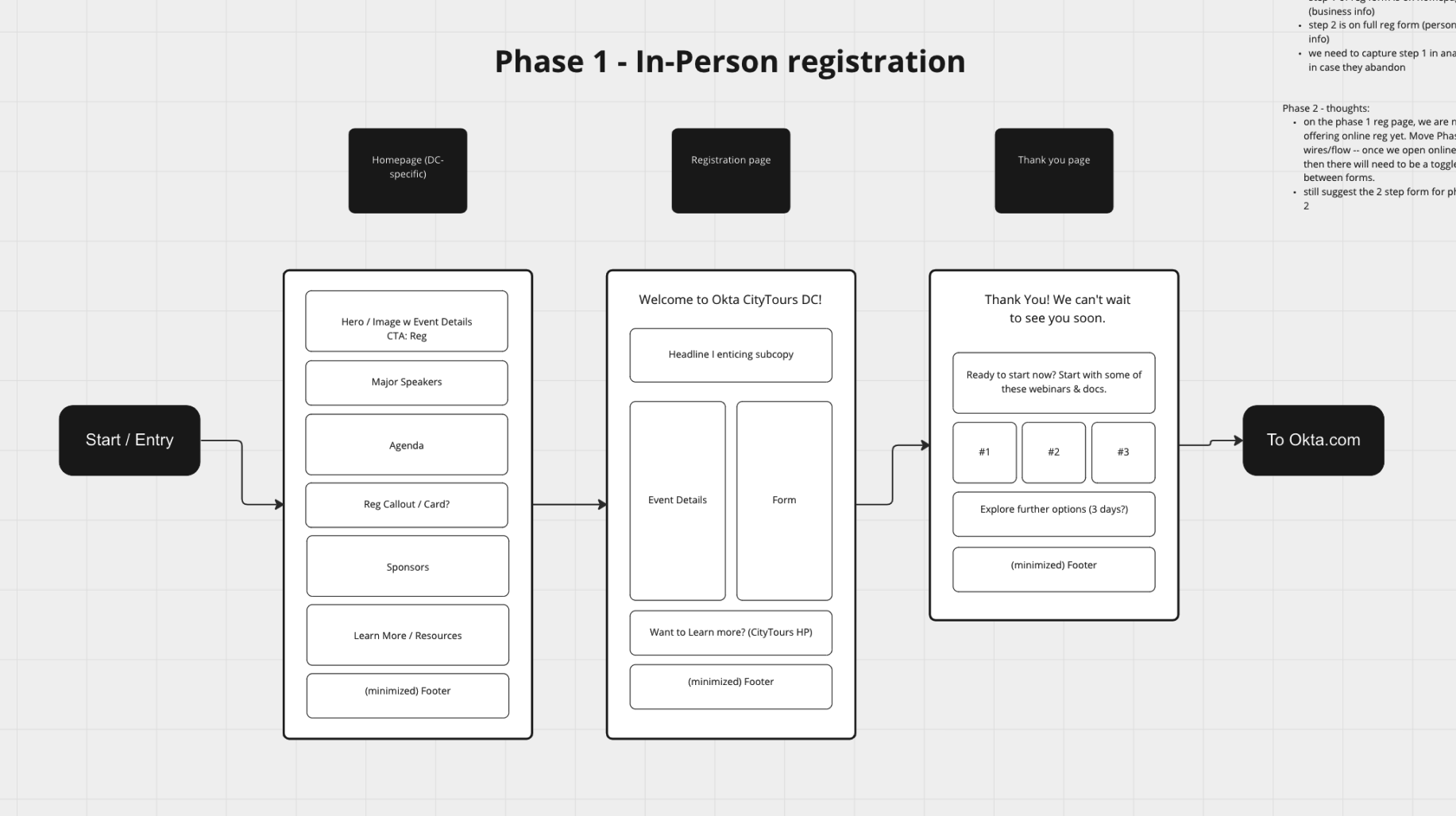
Version 1 wireframes and user flow sketches. Basic flow including how users would start on the event homepage, then through registration and a quick "thank you" page to confirm their RSVP.
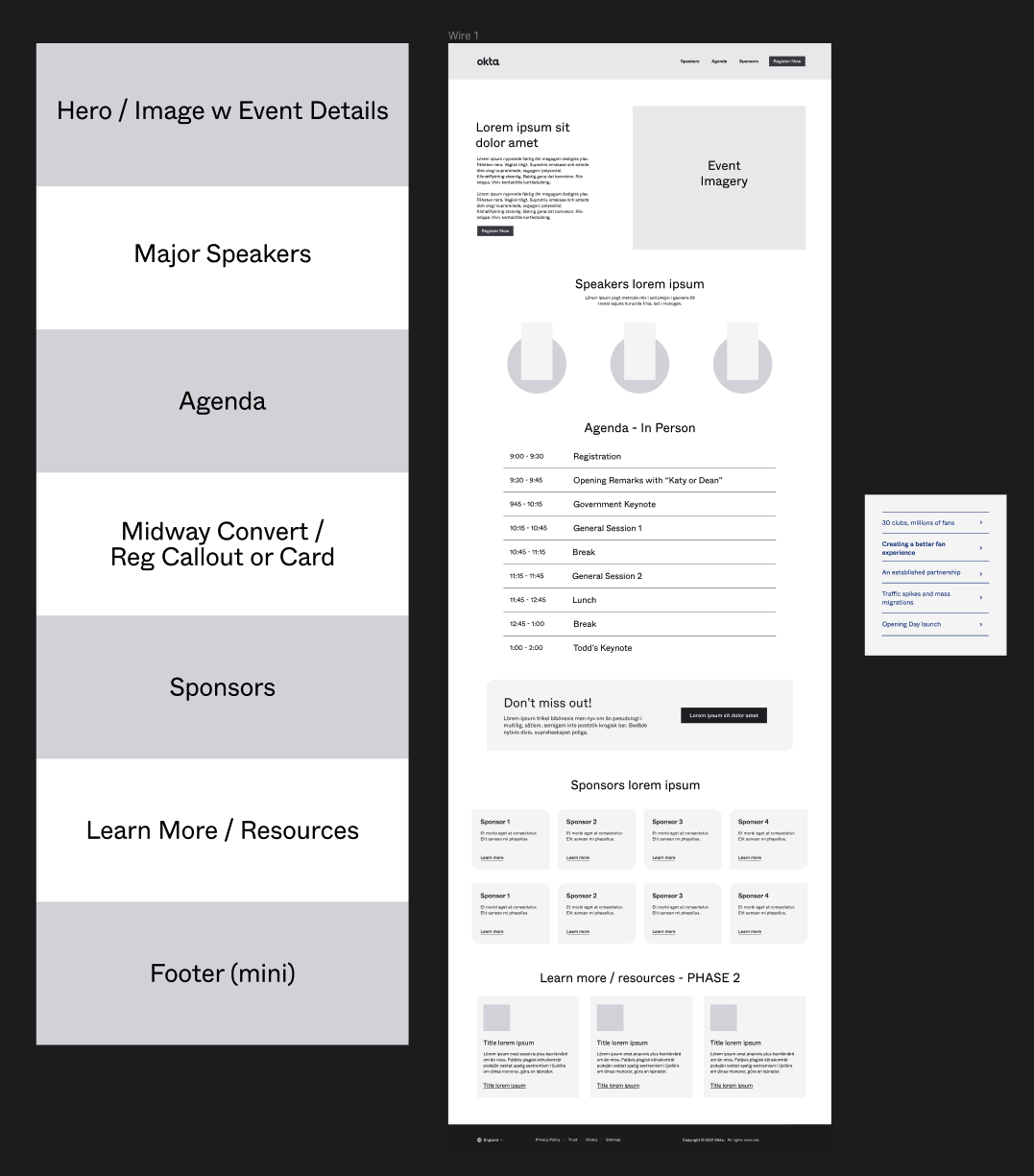
Version 2 of the wireframes and user flow, now with two separate flows differing between pre-event and post event. The user flow had to accomodate users both registering the day of, as well as the user traffic looking to log on and watch. Wireframes were expanded into the individual steps within registration (including email confirmation), with high level visuals added.
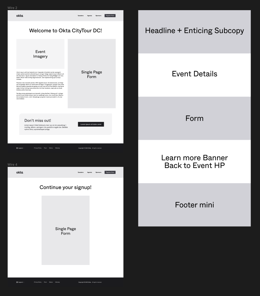
The final wireframes and user flow of the livestream "Phase 3" of the CityTours microsite. Some elements were removed and visuals were scaled down to allow for Brand design to make their own adjustments to the branding graphics. Page wireframes were separated from the overall flow to allow separate developers to focus on their respective pages and reduce confusion/
Phase 2 - Post-event view for on-demand watching
The "Phase 4" post-event userflow and general wireframes, with complete design, UX, and developer annotations.
The post-event homepage, showcasing the featured speakers and events, allowing users to sign up and watch the sessions on-demand.
The separate on-demand sessions list, with links to allow users to watch the individual sessions.
The on-demand video player page, with the user selected video available to watch above. Once users are logged into the on-demand viewing hub, they will be able to choose whichever session they'd like to watch next below.
Final thoughts
The scope and influence of this project was significant; In addition to building a livestream experience from scratch “0 to 1”, it also provided multiple registration paths and a post session repository of on-demand video offerings. In the end, I have a few insights and thoughts on how I’d conduct a similar project again:
- Mobile View Needed— We needed to deliver a better experience for mobile, as most of the resources were dedicated to the desktop view. If I were to conduct this project again, I would build the experience as “mobile-first”, to ensure a consistent flow across all viewports.
- Clearer Login / Registration Flow — The login flow was dictated by the underlying platform's authentication methods, with said functionality being unclear until late in UX's involvement. Overall, this made the design process and eventual user experience cumbersome and confusing.
- More forgiving timeline required — Each team including UX, Brand, and Dev, had around 2 weeks, give or take. With such a tight timeline between each stage, there was little to no margin for error or confusion.
- Interaction between attendees and sales — There was no way for attendees to contact sales directly within the event microsite. A chatbox for sales was planned, but due to the timeline could not be implemented.